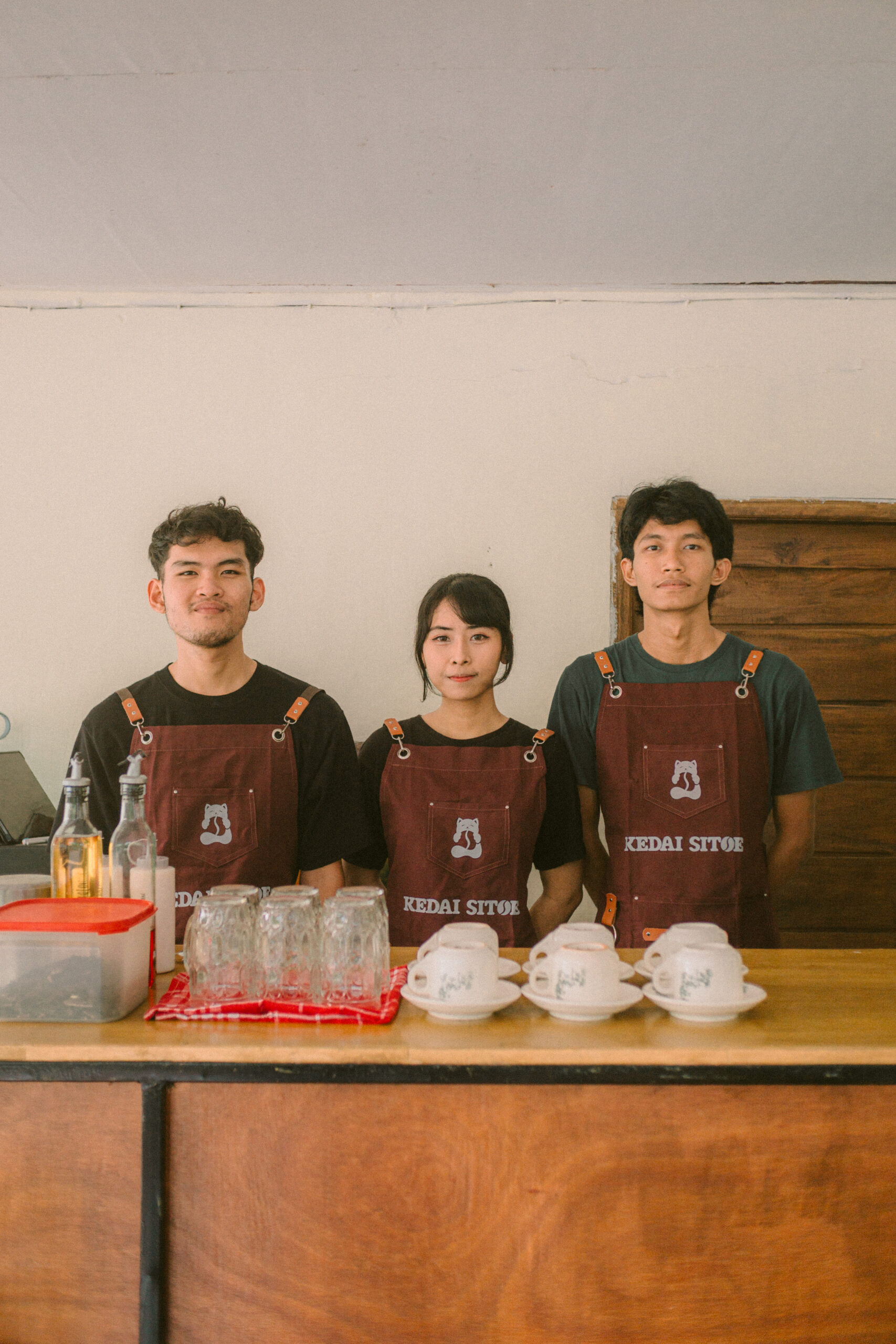
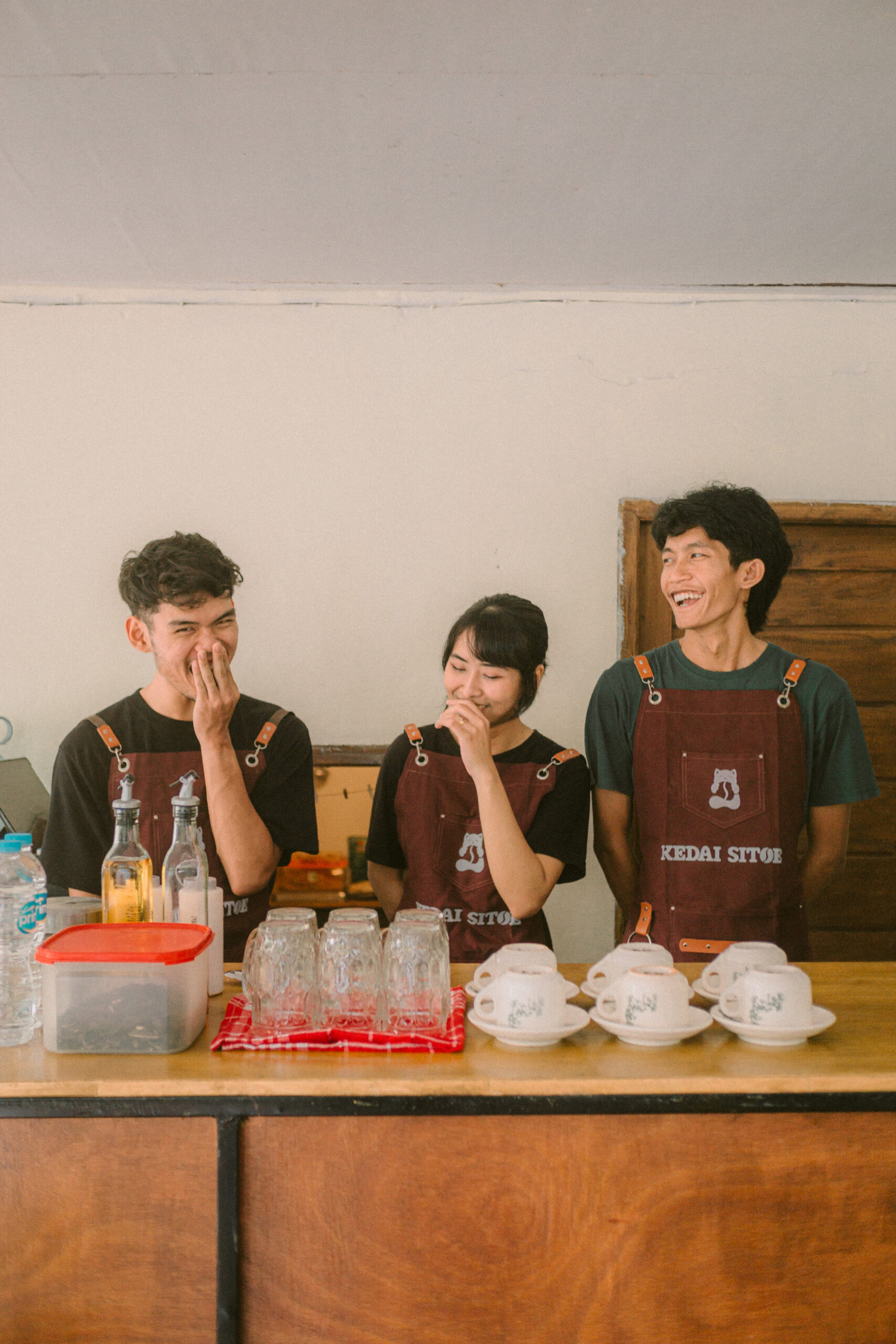
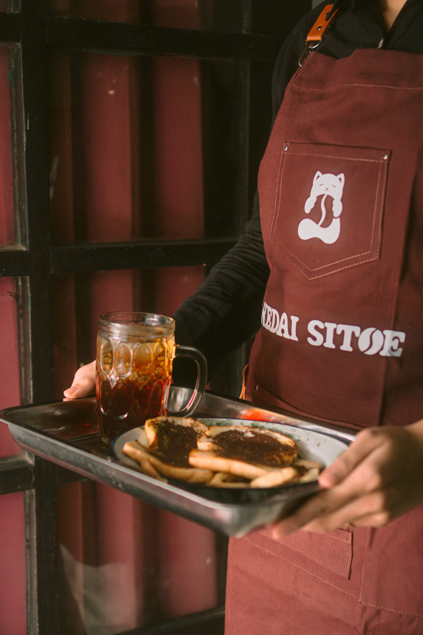
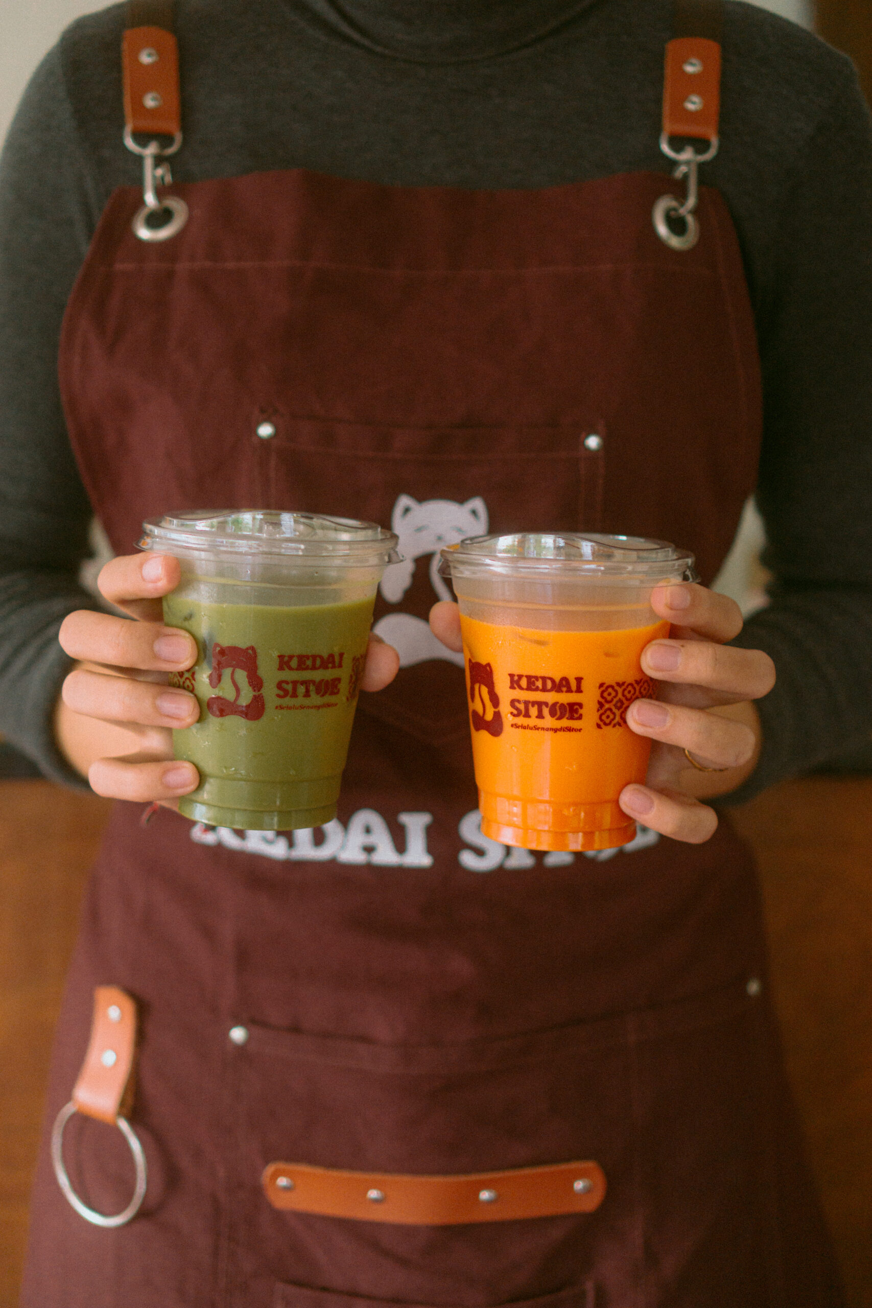
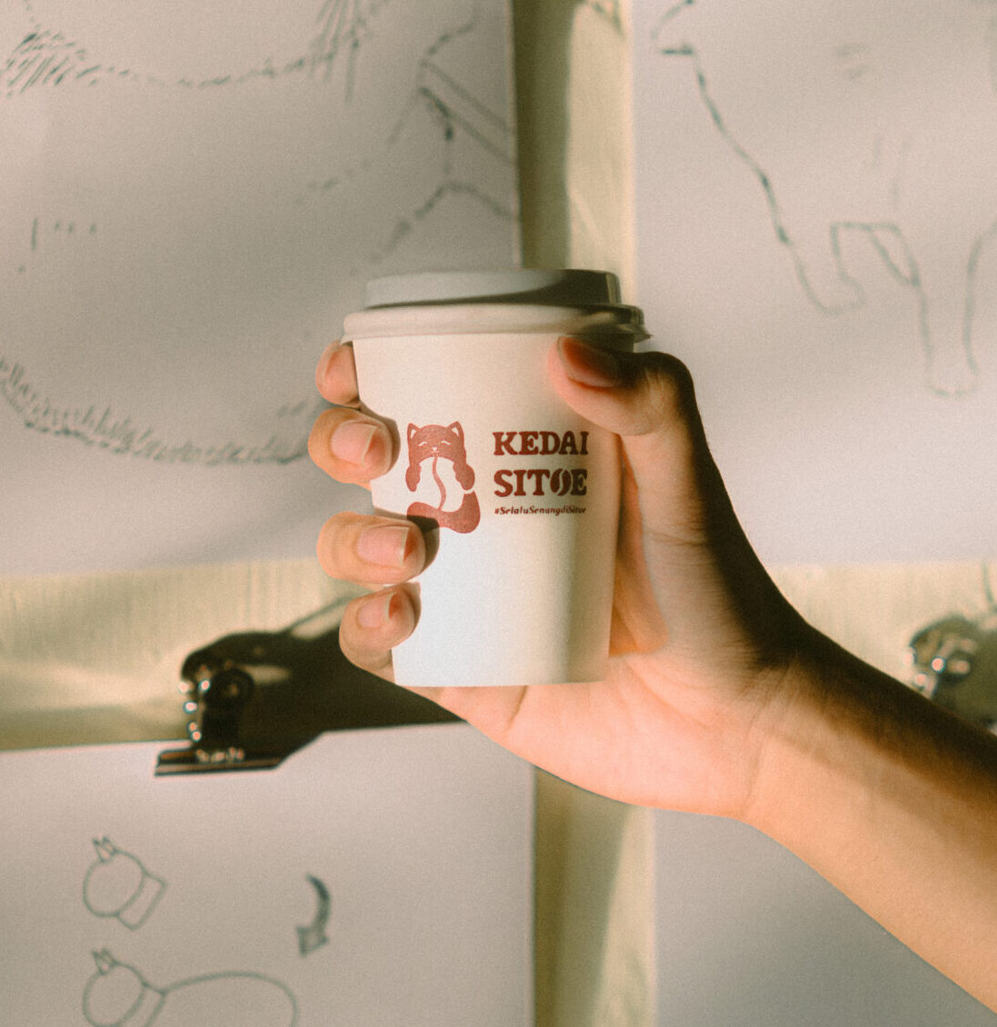
The logo shows a cat embracing coffee beans, a subtle but clear way to communicate that coffee is the heart of the business. Through deliberate branding choices, Kedai Sitoe doesn’t just look “cute”, it stands out in the market as a small café with character, meaning, and a story worth remembering.
Color Palette
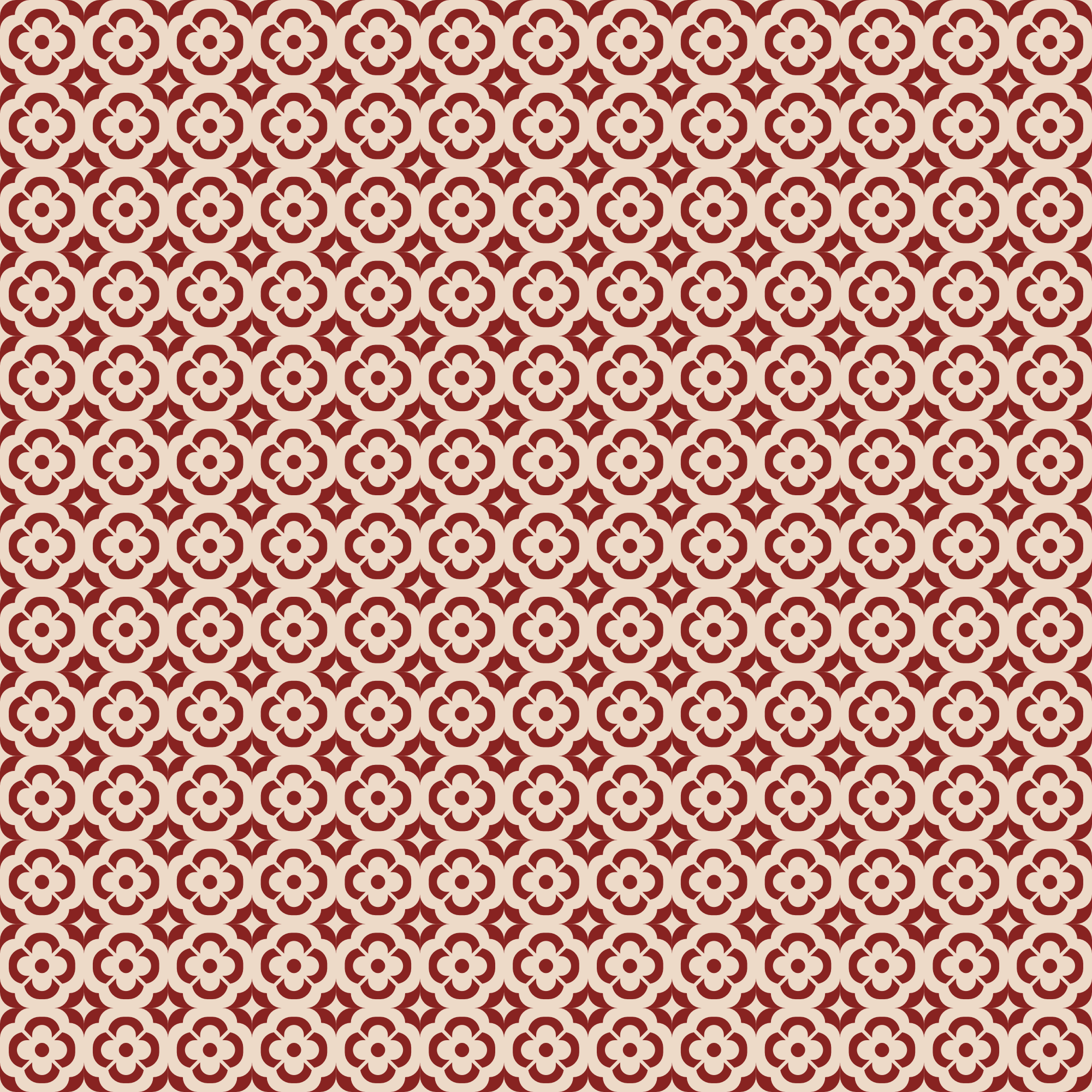
To strengthen that personality, Kedai Sitoe embraces a nostalgic retro palette of red and green, drawing influence from classic Chinese color symbolism. In Chinese culture, cats are seen as a symbol of luck and good fortune, and that idea blends nicely with the café’s identity as a friendly, welcoming place for everyone.
Start a Project